

A logotype where every letter was drawn by a different emigrant — none of them saw what the others had drawn.
2 Weeks
Branding


"Кто куда" — Who's Where — an identity for a podcast about emigration: about people, their stories of leaving, adapting and trying to feel at home somewhere new. THE METHOD If the podcast is about emigrants, the logotype should be drawn by emigrants. I talked to people from different professions — a dentist, a musician, a bar manager, a chef, a designer — told them about the project, and asked each one to draw a single letter the way they pictured it. Nobody saw the letters drawn before them. Every person worked blind, from their own idea of what that letter should look like. I filmed each of them drawing.

Each letter carries a different hand. Together they hold as one word, but none of them belongs to a single system — which is exactly the point. We're all from different cities and countries, all very different, and we speak the same language. The first letter, "К", turned out heavy and dominant. I thought it might overpower the rest. We kept it — and its unexpected weight became the anchor of the whole logotype.
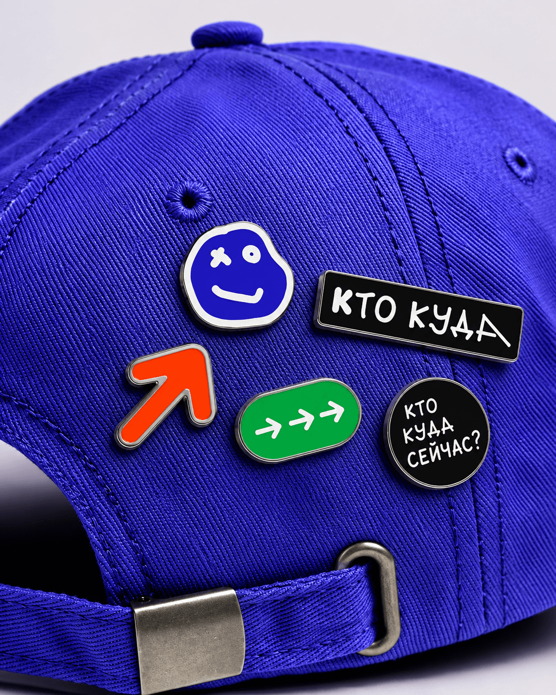
Same idea, four different hands. The head stays a rough hand-drawn blob — recognisable as the same character — while the eyes, the mouth and the outline itself shift with every version. Four states, four colours, one running conversation: "where are you going?" — "no idea yet" — "and you?" — "London." Every guest brings a different emigration story. The mark never settles into one fixed shape, and that's the point.